Have you ever thought about why you feel different emotions depending on the room or space you’re in? Chances are that you’re being influenced by the colour around you but that often isn’t a conscious thing. The art of using colour in interior design, harnessing the power of colour psychology, is one tool that we use to create the perfect space for each and every client.
Part of our consultation process is to find out from our clients how they use a space, what they will do in it and how they want to feel. There are certainly some common themes, for example in an office or working space, concentration and focus are needed but, in a bedroom or snug you want to relax and wind down. We take this all into account when we compose the colour palette.
As interior designers, we will search for the perfect colours to fit the purpose of the room and build a design around that.
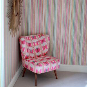
Warm colours, associated with fire, sunlight, and nature elements, evoke a range of emotions and feelings associated with energy, passion, and comfort. Within the range of warm colours orange lends itself to energy, enthusiasm and creativity, and can create the perfect cosy space to recharge.
Cool colours will bring about emotions and feelings associated with calmness, serenity, and tranquillity and are associated with water and sky elements. Blue is linked to calmness, peace and serenity and is perfect for anywhere you want to feel restful and refreshed.
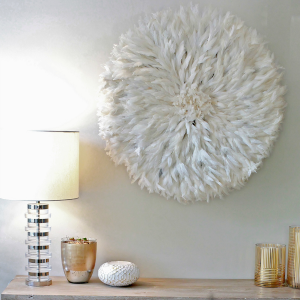
Monochrome themes are particularly effective; a monochromatic palette focuses on using one colour, and a range of hues of that colour. To achieve depth and interest, textures and patterns in the colour as well as using lightness and darkness are introduced. The addition of accents of brushed brass and black will bring impact and definition to a monochromatic scheme, or if your lifestyle allows, keeping everything light and tonal is the ultimate in ‘quiet luxury’.
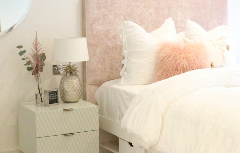
The Bedroom
The place where you end your day, a room for total relaxation. To create that mood, blue is the colour to choose here. The calmness and serenity which blue brings about are the perfect emotions when you’re settling down to sleep. There is a huge range of different blues, and you can evoke nuances of emotions by using pale hues, bolder blues and the whole range in between. Here are some of our favourite blues to use in your bedroom; they work together beautifully to both look and feel good.
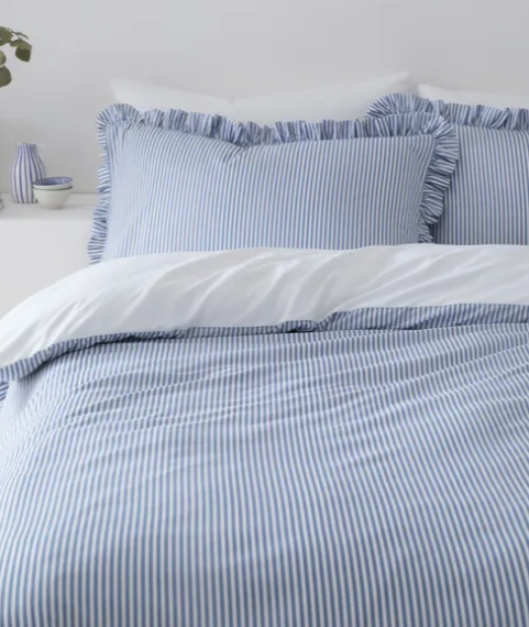
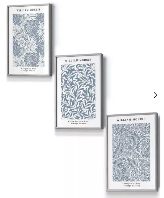
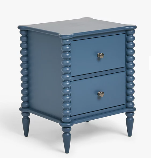
Bedside cabinets don’t need to be bland! The Bobbin Bedside Table from John Lewis is a brilliant example of an interesting piece which can complement the blue hues within a room. Artwork is another great way to introduce colour into a room, and we love this set of William Morris Vintage Floral wall art from Debenhams. And, of course, we couldn’t ignore bed linen. This is undoubtedly the easiest way to bring colour to a bedroom, and the Hampton Frill Duvet Set from Dunelm is in a gorgeous shade with a pretty finish.
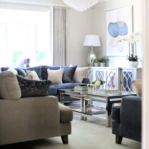
The Living Room
You could argue that a living room is also a place you want to relax. To a degree this is true, but it is a more flexible space with a different purpose. In a living room warm colours work wonderfully because their warmth conjures cosiness and a general sense of being welcomed. Warm colours include rusty oranges, mustard yellows, and soft pinks that will induce feelings of love, enthusiasm, optimism, happiness and affection. Here are some of our favourite things from this palette.
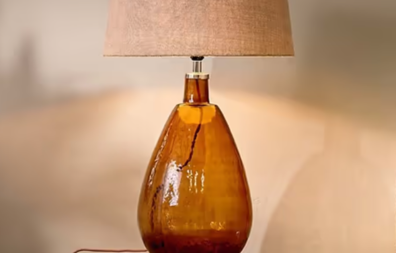
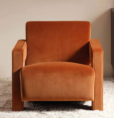
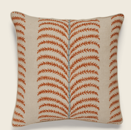
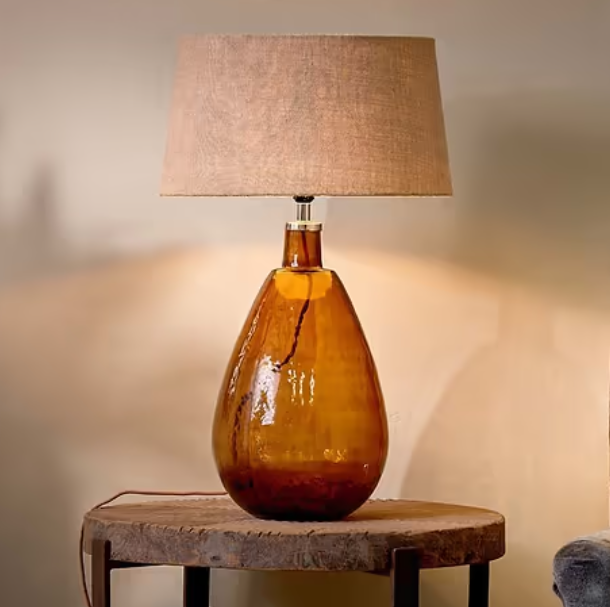
In a sumptuous velvet fabric, the Brompton Sculptural Armchair from daals fully embodies that welcoming and cosy feeling that you want in your living room. Add a lamp for a warm lighting effect and ambience; we love the Baba Recycled Glass Lamp from nkuku. Soft furnishings should never be forgotten when it comes to colour. They are versatile and come in such a huge variety you will be able to match any design theme. We love the Areca Cushions from Oka for a touch of warm orange.
Tips and Hints
- The size of a room and the amount of natural light it receives can impact the way colours appear. In smaller spaces, lighter hues can create an illusion of openness, while in larger rooms, bolder colours may add warmth and cosiness.
- Pay attention to the direction of the room—north-facing rooms might benefit from warmer tones to counteract cool lighting, while south-facing rooms can embrace cooler tones.
- Ensure your chosen colour scheme complements the existing furnishings and décor elements, creating a cohesive and harmonious overall design.
Remember that you can see more of our work, interior design tips and ideas when you follow us on Facebook.