Richer Colours, Warmer Interiors

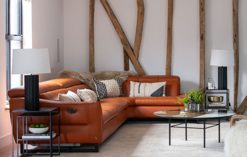
Richer, warmer colours can bring depth, character and warmth to an interior. Deep browns, maroons, plums, rust and burnt orange can add another dimension to a room, whether they’re part of the main palette or introduced in smaller details.

You don’t need to completely redecorate to bring these colours into your home. The key is choosing shades that complement your existing scheme, then weaving them through the room rather than treating them as a single accent.

Start with the colours you already have

Before buying anything new, look at the colours already established in your room.

With a predominantly neutral scheme, you have plenty of flexibility. Rust, burnt orange, maroon and rich brown can all work well, particularly shades with an earthy or brown undertone. Be more cautious with very bright, pillar-box shades, which can feel stark against softer neutrals.

If your room contains blues and greens, look towards cooler plums, berry shades and blue-toned maroons. For warmer neutrals and earthy schemes, rust, burnt orange, terracotta and warm browns can build naturally on what’s already there.

Colour can significantly affect both the appearance and atmosphere of a room. We explore this further in our blog The Power of Colour.

Start small, then repeat the colour

A cushion, throw, lampshade, vase or piece of artwork can be enough to introduce a new shade. The important part is not to leave that colour sitting on its own. Look for opportunities to echo it elsewhere in the room.

Everything doesn’t need to match. A rust cushion might be picked up by a deeper tone within some artwork, with a related shade appearing again in a ceramic accessory. Repeating colour subtly helps it feel part of the room rather than something simply added to it. Let show you how this can work in your home.

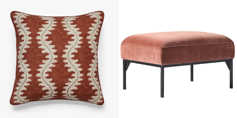
The Lahar Cushion Cover from OKA and West Elm Penn Ottoman from John Lewis complement each other, and being placed in different positions within the room, introduce the repeated tones.
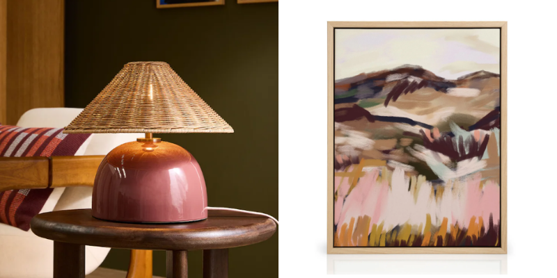
Another example of how this can work in your home is pairing the MADE.COM Burgundy Red/Rattan Nora Table Lamp from Next with the French Landscape No1 Canva Print from Desenio.
Use pattern to bridge the gap

Pattern can be particularly useful when introducing a new colour into an established scheme.

Rather than adding a solid block of maroon or rust, try a stripe or pattern that includes both your existing colours and the new shade. It creates a visual connection between the two and makes a richer colour easier to introduce.

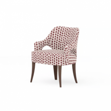
We love the Madison Chair from Love Your Home. The coral colour of the pattern introduces a warm colour beautifully without being overwhelming, and with a choice of colour for the chair legs, you can be sure that it can fit in with your existing décor.
Mix your materials as well as your colours

Think about the materials you’re using too. Velvet can give a richer shade depth and softness, while linen creates a more relaxed effect. Ceramic provides a solid accent, while coloured glass introduces colour with less visual weight.

Combining materials also avoids an overly coordinated look. A velvet cushion, striped linen textile and piece of coloured glass can all bring slightly different versions of warmth into the same room.

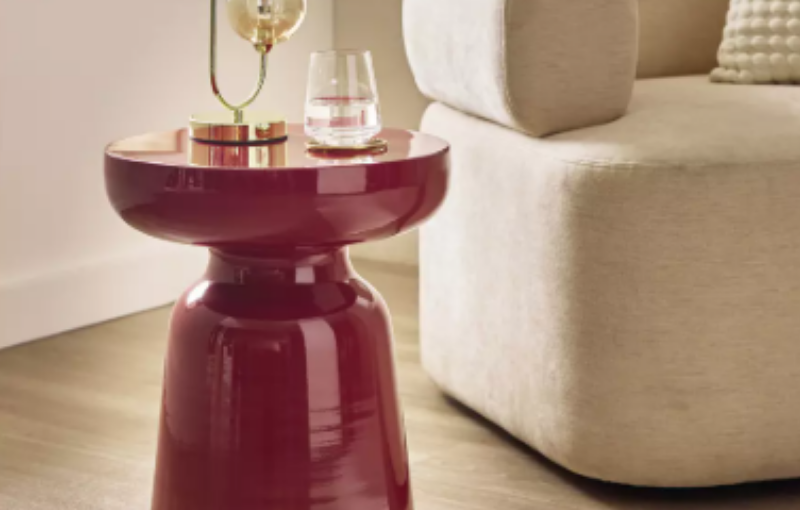
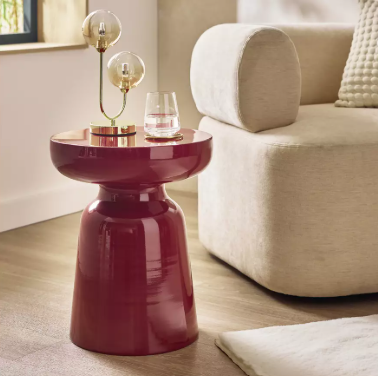
We love the Habitat Cohen Side Table in Pomegranate from Argos. Its rich colour and high gloss make it a stand out piece.
A few things to keep in mind

  • Consider the light. Look at new colours in both natural and artificial light before committing to larger pieces.
  • Vary the scale. Balance larger areas of colour, such as a throw or rug, with smaller touches elsewhere.
  • Allow some breathing space. Quieter areas give richer colours and textures more impact.
  • Don’t aim for an exact match. Different shades within the same colour family can create greater depth.
  • Add gradually. See how each addition changes the balance of the room before introducing more.

If you know the feeling you want to create but aren’t sure how to bring the different elements together, Interiors at 58 can help you find a scheme that works with both your home and the way you want to live in it. And for more interior design inspiration, remember to follow us on Facebook.
The Art of Bringing a Kitchen Together

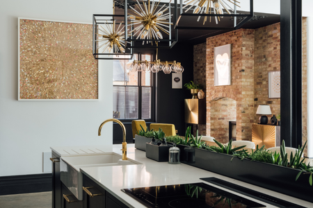
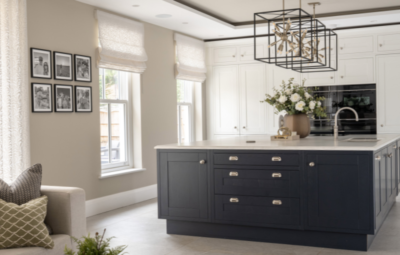
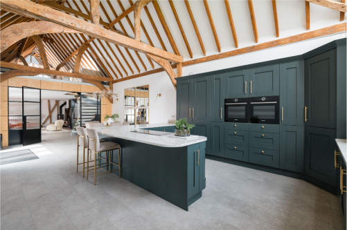
Many people start by choosing the kitchen itself. They find a door style they love, pick a worktop that catches their eye and begin making decisions one element at a time. In reality, that’s not how a well-designed kitchen comes together.

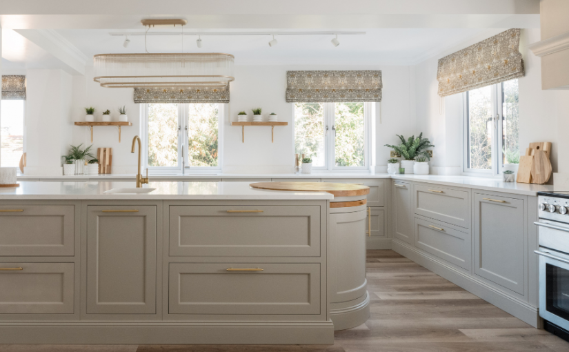
The most successful kitchens aren’t built around individual products. They’re created by considering how every finish, material and colour will work together before anything is ordered.

Looking at the Whole Picture

When we’re designing a kitchen, we’re never just thinking about the cabinetry.

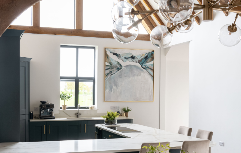
Long before a design is signed off, we’re already considering the flooring, worktops, wall colours, hardware and lighting. Every decision influences the next, and it’s only by seeing them together that you can be confident they’ll create the look you’re hoping for.

It’s surprisingly easy to fall in love with a beautiful worktop or a particular kitchen display in a showroom. The challenge comes when those individual choices are brought together in your own home and how they might relate to any adjacent rooms or spaces.

A kitchen doesn’t exist in isolation. Every material has to relate to the others, creating a space that feels balanced rather than a collection of separate decisions.

Why Contrast Matters More Than Matching

One of the biggest misconceptions in kitchen design is that everything should coordinate as closely as possible.

In reality, contrast is often what gives a kitchen its character.

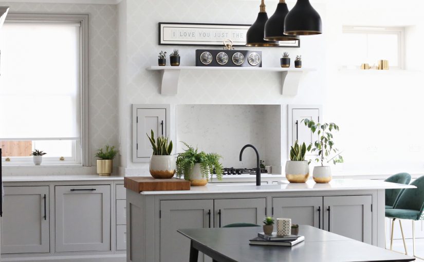
Contrast isn’t simply about choosing different colours. It’s about creating enough variation in tone and texture so each element has its own place within the design. Your cabinetry, worktops, flooring and wall colours should complement one another, but they also need enough distinction to stop the room feeling flat.

This is where mid-toned kitchens can become surprisingly challenging.

Many people assume they’re the safest option because they sit comfortably between light and dark. In practice, they can actually be one of the trickiest palettes to work with. When the cabinets, flooring and walls all sit within a similar tonal range, the whole room can lose definition.

That doesn’t mean you should avoid a mid-toned kitchen. Far from it. It simply means the surrounding finishes need even more careful consideration. Sometimes the answer is introducing a much lighter wall colour, a darker worktop or flooring that creates the contrast needed for the whole scheme to come to life.

These are exactly the kinds of design decisions that happen behind the scenes before a single cabinet is ordered.

Designing for Today — and Tomorrow

A new kitchen is a significant investment, so it’s worth thinking beyond how it will look on the day it is installed.

Some elements are relatively simple to update over time. Walls can be repainted, handles can be replaced and even cabinetry can often be refreshed with a new colour in years to come.

Flooring is a different story.

Replacing a kitchen floor is far more disruptive and expensive, so it’s worth choosing something with longevity. Additionally, if you even think it’s a possibility you might replace the kitchen in the future but not change the floor, it’s essential you run the floor under all of the units and cover the full floor. It may be more cost-effective to run the floor up to the units, but it limits any future kitchen to the same layout unless the floor is replaced.

Designing with that flexibility in mind means your kitchen has the opportunity to evolve with your home and your style over the years.

The Design Work You Never See

One of the most valuable parts of interior design happens before any products are ordered.

It’s considering how the layout will affect the usage, where your sockets are placed for ease and comparing samples in different light to ensure the perfect finish. It’s asking questions that many homeowners wouldn’t think to ask until much later.

Those decisions may not be obvious when you walk into a finished kitchen, but they’re often the reason it feels balanced, cohesive and effortlessly put together.

A beautiful kitchen isn’t created by choosing beautiful products. It’s created by choosing products that work beautifully together.

Remember to follow us on Facebook for more interior design tips and advice. 

The Principles of Beautiful Styling

Beautifully styled homes often look effortless, but there’s usually much more thought behind them than first meets the eye.

It’s easy to assume the secret lies in buying the right accessories, but in reality it’s less about what you choose and more about how you use it. Interior designers look at a room as a whole, considering balance, proportion and how each piece contributes to the overall feel of the space.

Styling isn’t an exact science, and much of it develops through experience. However, there are a few principles that can help you look at your own home with fresh eyes.

Think in Arrangements, Not Individual Objects

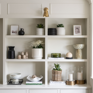
Rather than styling one item at a time, think about how pieces work together as a collection.

A simple arrangement might include:

  • A group of three or five objects
  • A tray to bring items together
  • Pieces that naturally complement one another

The aim is to create one considered display rather than several separate objects competing for attention.

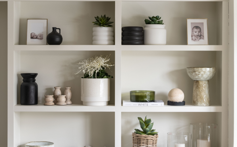
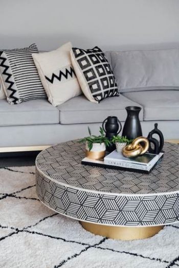
Group accessories together rather than styling one item at a time. A collection will often feel more balanced than individual pieces.

Create Layers

Displays often feel more interesting when they have depth.

Instead of placing everything in a straight line, consider layering pieces together by using:

  • Books to introduce height
  • Artwork behind accessories
  • Objects positioned slightly in front of one another

Small changes like these can make a display feel more natural and considered.

Stack items in front of one another instead of placing everything in a straight line to create depth and interest.

Focus on Balance Rather Than Matching

A well-styled space doesn’t need everything to match perfectly.

Instead, think about creating balance by varying:

  • Height
  • Shape
  • Size
  • Texture

Combining different materials, such as ceramics, glass, wood and woven finishes, helps create interest without making a display feel busy.

Balance comes from mixing different heights, shapes, sizes and textures, not from everything matching perfectly.

Leave Space to Let Your Styling Shine

One of the easiest mistakes to make is trying to fill every shelf or surface.

Giving your displays a little breathing room allows each piece to stand out and creates a calmer, more balanced feel.

If something doesn’t quite look right, try removing an item before adding another. Sometimes less really is more.

Less is more. Leaving space around your displays often has more impact than filling every shelf.

Style for Your Home, Not Someone Else’s

The most memorable interiors aren’t filled with expensive accessories. They’re filled with pieces that have meaning.

Books you’ve enjoyed, favourite ceramics, treasured finds or family photographs all help tell the story of the people who live there. Mixing these personal touches with decorative pieces creates a home that feels authentic rather than staged.

Your home should reflect your lifestyle and personality, not simply recreate a photograph you’ve seen online.

The most memorable interiors are filled with pieces that have meaning, not simply pieces that match.

Styling isn’t about following a set of rigid rules or buying more decorative pieces. It’s about understanding a few simple principles and applying them in a way that feels right for your home.

By thinking in arrangements, introducing layers, creating balance, leaving space for the eye to rest and choosing pieces that have meaning, you can create displays that feel thoughtful, welcoming and beautifully considered. Sometimes the smallest adjustments are all it takes to make a room feel complete. For more interior design advice and guidance, remember to follow us on Facebook.
The ‘Why’ for Your Home

We often assume that when a room no longer feels right, the answer is a new sofa, a different paint colour, new accessories or maybe a whole new look inspired by the latest trends.

However as Interior Designers, we start by asking a much more important question: why isn’t this space working for the people who live in it? Even though a room is beautiful, it can still be frustrating to use, and the biggest design challenges may not be the things that stand out immediately. They might be the small frustrations and compromises that have quietly become part of everyday life, a sofa layout that doesn’t work or a perpetually dark and dismal corner.

We look at how you really live in the space

A beautifully designed room is not just about how it looks. It is about how it supports your daily routines.

As designers, we pay attention to the things you may no longer notice. Where do you naturally sit? Which areas of the room do you avoid? Where does clutter repeatedly gather? Which parts of your home are working hard and which are underused?

Often, the answers reveal that your home has simply not evolved alongside your life. A room designed around young children may no longer suit teenagers or a spare bedroom may have slowly transformed into a home office.

We look for the real problem, not just the obvious one

One of the biggest differences between decorating and interior design is understanding the reason behind a problem.

For example, a room that feels cluttered, does not always need more storage. A room that feels empty, does not necessarily need more furniture. A space that feels uncomfortable may not require a complete redesign.

Sometimes the issue is about flow and how you move around a room. Sometimes it is about the scale of the furniture, the way a space is zoned, or how different areas are being used.

By stepping back and looking at the bigger picture, we can help you identify the real issue before investing in a solution that may only temporarily improve things.

We consider the room as a whole

Most homes are not designed all at once. They develop gradually over time.

A sofa chosen years ago. A favourite chair inherited from family. Artwork collected during travels. A lamp bought because it caught your eye.

These pieces often hold memories and tell the story of your home. The goal does not have to be to replace everything and start again. However, sometimes a room becomes a collection of individual choices rather than a space that feels connected and intentional.

As Interior Designers, we look at how everything works together, including the layout, colour palette, textures, proportions, lighting and atmosphere, therefore helping you create a space that feels balanced and truly reflects the people who live there.

The best designs start with questions, not purchases

If you are struggling to understand why a room no longer works, a fresh pair of professional eyes can often reveal possibilities you may never have considered.

Whether you are planning a complete redesign or simply want guidance on making better decisions for your home, we would love to help you uncover the potential in your space.

Get in touch to find out more about our interior design services, and follow us on Facebook for more expert interior design advice, inspiration and practical tips.

Creating Balance in Bright Spaces

When we talk about light in a home, the conversation usually centres around making dark rooms brighter. But spaces filled with natural light come with their own challenges too.

Conservatories, glazed extensions, bright kitchens and south-facing rooms can often feel difficult to balance. During the day they may feel overly bright, washed out or too warm, while in the evening they can suddenly feel flat or lacking in atmosphere. Good interior design is not simply about adding more light — it is about learning how to work with it.

Managing Bright Light

One of the biggest mistakes people make in naturally bright rooms is trying to block the light completely. Heavy blinds or dark curtains can quickly make a room feel disconnected from the very feature that makes it appealing in the first place.

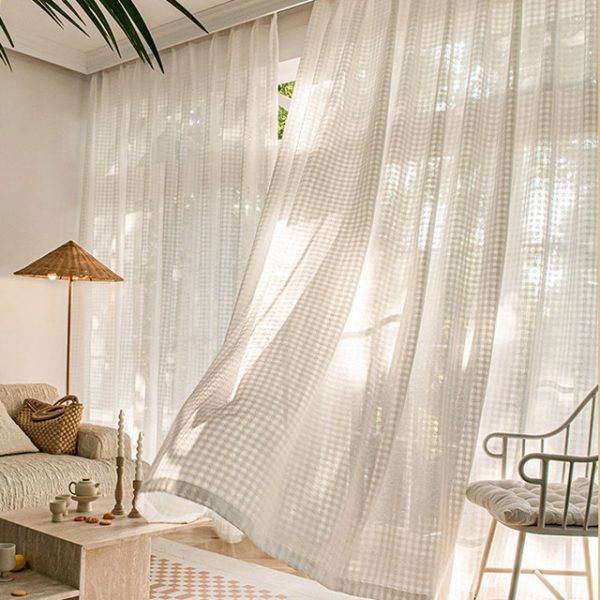
Instead, it is usually more effective to soften and diffuse the light. Sheer voiles, lightweight linens and textured fabrics can help reduce glare while still allowing the room to feel open and airy.

Ethereal grid ivory white linen style sheer curtain from www.voilavoile.com

Texture also affects how light behaves within a room. Glossy finishes and overly reflective surfaces can intensify brightness and create harsh glare, particularly in rooms with lots of glazing. Softer textures through flooring, upholstery, timber finishes or matt paint can help create a calmer atmosphere without making the room feel darker.

Introducing a darker tone in selected areas can also help create definition in a naturally bright room. This could be through painted woodwork, a chimney breast, built-in cabinetry or another architectural feature. In spaces flooded with natural light, these darker elements can add depth and contrast without making the room feel heavy. They also help create a scheme that feels balanced throughout the year, rather than a room that only works during the brightest months.

Naturally bright rooms still need carefully considered lighting to feel welcoming in the evening. Table lamps, wall lights and softer pools of light help transition a room from daytime brightness into a more relaxed evening environment.

How Natural Light Changes Colour

Natural light has a huge impact on how colours appear in a room, which is why paint can sometimes look completely different once it is on the wall.

In south-facing spaces, warm sunlight can intensify creamy tones, earthy neutrals and warmer colours throughout the day. While this can create a beautiful glow, it can also make some colours feel stronger or more yellow than expected. Cooler tones can help balance this warmth, but in very bright rooms they can occasionally appear flatter or more washed out.

This is why testing colours properly in the room itself is so important. A shade that works beautifully in one room may behave completely differently in another.

Morning light, afternoon sunlight and evening shadows all alter the mood of a space. The most successful schemes are often the ones that feel balanced across changing conditions.

Creating Flow Between Inside and Out

Inspiration from KLG Rutland

Bright rooms often sit closest to the garden or patio, so creating a sense of connection between inside and outside can make the whole home feel calmer and more cohesive.

This is less about themed styling and more about continuity through materials, tones and layout choices. Flooring can help the transition between spaces feel more natural, while thoughtful furniture placement keeps movement between the house and garden easy and uninterrupted.

Natural materials such as timber, stone, linen and woven textures work particularly well because they soften brighter environments while still feeling timeless and relaxed.

Creating Ambience in Bright Spaces

One of the most overlooked aspects of designing bright rooms is thinking about how they feel after sunset.

A conservatory or glazed extension that feels beautiful at midday can sometimes feel stark in the evening. Layered lighting, texture and zoning all help larger bright rooms feel warmer and more inviting.

Layered blinds look fabulous in Sopwell House, as featured in Boutique Hotelier. This is one of our favourite local hotels, and it’s a great example of using wood cladding to soften a glazed area.

Ultimately, designing for bright spaces is about understanding how natural light changes the way a room looks, feels and functions throughout the day. When those details are considered carefully, bright rooms become some of the most enjoyable spaces in the home.

Remember to follow us on Facebook for more interior design insights.

Making Bold Colour Choices With Confidence

Bold colour has a way of capturing attention. Whether it’s a striking feature wall, richly painted cabinetry or statement tiles, it often appears in the most inspiring interiors. But while it’s easy to admire, it can feel much harder to commit to in your own home.

Trends come and go, and what feels exciting now can quickly feel dated. More often than not, the hesitation isn’t about liking colour — it’s about wondering whether it’s the right choice for your space, and whether you’ll still love it in a year’s time.

The key to using bold colour successfully isn’t about being brave. It’s about being considered.

Why Bold Colour Can Feel Daunting (And How to Approach It Properly)

Choosing bold colour can feel like a big step. Unlike smaller decorative changes, it’s more visible, more impactful, and often more permanent. That’s what makes it feel daunting.

But this isn’t about taking a leap into the unknown. It’s about making a decision you feel confident in.

Testing is where that confidence comes from. Rather than relying on a small paint card or a quick decision, take the time to see how a colour really behaves in your space. Use larger samples, place them in different areas of the room, and look at them at various times of day. Natural and artificial light will change how a colour appears, sometimes quite dramatically.

Living with a sample for a few days allows you to move beyond first impressions and make a choice that feels right long term.

Start With How You Want the Room to Feel

Before choosing any colour, it’s important to take a step back and think about the purpose of the room.

How do you want it to feel? Energised and sociable, or calm and restorative? A bold colour should support that feeling, not work against it. This is where colour becomes more than a visual choice — it becomes a functional one.

If you’d like to explore how colour influences mood and atmosphere in more detail, you can read more in our blog, The Power of Colour.

Starting with feeling, rather than colour itself, helps guide decisions in a way that feels much more natural and cohesive.

Choosing Where Bold Colour Works Best

Introducing bold colour isn’t about adding more — it’s about placing it with intention.

There are many ways to bring stronger colour into a space. It might be through paint or wallpaper, cabinetry, tiled areas such as splashbacks, or architectural features like panelling and alcoves. The approach you take will depend on the space, but the principle remains the same.

Think about what naturally draws the eye when you enter the room. This is often the best place to introduce a bold element. Used well, colour can highlight key features and create a sense of balance within the space, rather than competing for attention.

It’s also important to consider how the colour sits within the wider home. A bold choice should feel connected, not isolated, particularly in open-plan or adjoining spaces.

Getting It Right: Practical Considerations

Bold colour works best when the practical details are carefully considered.

Light plays a significant role. North-facing rooms can soften and cool colours, while south-facing spaces tend to enhance their warmth and intensity. Understanding this helps avoid surprises once a colour is on the wall.

Undertones are equally important. A colour that looks perfect in isolation may clash when placed alongside flooring, cabinetry or existing finishes. Viewing everything together ensures a more cohesive result.

Taking time with these decisions makes all the difference. The most successful schemes are rarely rushed.

Refining Your Colour Choice

If you’re unsure about committing to bolder colours, it can help to look at less primary options.

For example, a deep grey-blue or grey-green can feel softer and easier to live with, while still adding the sense of drama you’re looking for. If you’re leaning towards warmer tones, there are some beautiful deep burgundy and maroon shades available at the moment. These work particularly well in cosy spaces such as dining rooms or snugs, where you want to create a more intimate feel.

Another way to approach a darker colour palette without it feeling overwhelming is to be more selective about where you use it. Applying colour to woodwork or the ceiling allows you to introduce depth and contrast, while keeping the walls lighter and more neutral.

Confidence Comes From Clarity

Using bold colour doesn’t need to feel overwhelming. When decisions are guided by purpose, placement and careful testing, they become much easier to make.

A well-chosen colour has the ability to completely transform a space, adding depth, character and a strong sense of identity.

If you’re unsure where to start, this is exactly where professional guidance can help bring clarity and confidence to your decisions. And for more ideas and inspiration, you can follow along on Facebook.

Designing Calm into Your Home

When your house is a busy hub for your family, it is easy for each room to become filled with activity, noise and the inevitable clutter of life. If that describes your home, we’d like to help you to create a pocket of calm amidst the chaos.

A bedroom is a natural starting point for a place of serenity, but a bathroom could work just as well, or, if you haven’t got a room that you can dedicate, it could be a corner or alcove that you claim for the purpose.

Bedrooms

 With the focus being on rest and relaxation, a bedroom might feel like an obvious choice for your designated calm space.

While neutral or soft colours are a solid choice in a bedroom because they keep it light and gentle, additionally lighting also has a big impact on how a room feels. Harsh overhead lights can be a hindrance to a calm atmosphere, so layered lighting works much better. A reading lamp provides brightness when needed, while table lamps or wall lights create a softer, more relaxed ambience.

Comfort and calm often go hand in hand, and bedrooms are the perfect place to introduce a sense of quiet luxury. High-quality bed linen, comforting throws, plush rugs and textured cushions can all add warmth and softness, helping the room feel inviting and restorative.

The addition of the Kyra Cream White & Natural Boucle Fringed Lumbar Cushion from daals is a comforting texture to add to a bed, chair or a window seat. 

For more ideas, click here to read our blog all about designing a bedroom oasis.

Bathrooms

Bathrooms are often one of the few places where we can step away from the activity of life. However, they are frequently designed with functionality as the main priority.  With a few thoughtful touches, we can change this.  

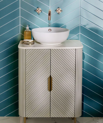
As with bedrooms, colour is key and gentle greens and muted blues can create a spa-like feel. Keeping the palette and base tones of the scheme consistent across tiles, paints and accessories allows the space to feel cohesive not busy.

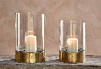
Metallic accents, such as brushed brass or gold, can add a sense of luxury. These can be introduced to the room through towel rails, taps and drawer handles, as well as smaller accessories such as candle holders and containers.

The Rajura Hurricane Lantern from Nkuku is the perfect accessory for adding low light to the bathroom, and adds that touch of luxe with the brass base.

Storage is key to a calm space. If you have a pedestal basin rather than a vanity unit, you can add storage, such as the Valencia Under Sink Storage Cabinet from Next.

Creating a Quiet Corner

You don’t need to dedicate a whole room to calm, even a small corner in your home can become a place to unwind.

Unused alcoves, corners of living rooms, window seats or quiet areas of a bedroom can all work beautifully. The aim is to create a space that feels visually separate from the surrounding activity.

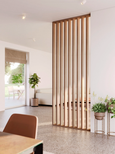
Open-plan zoning techniques work well here; you can make a corner feel separate by using a rug, a change of lighting or a different colour. Room dividers or shelving can also help create a subtle sense of separation without closing the space off completely.

Comfort should be the priority in these smaller areas. Soft textures, cushions and throws make the area inviting, encouraging you to actually use it rather than letting it blend into the rest of the room.

The Signature Room Divider Kit from Panelling Direct is a great option for zoning or diving the room, and it adds extra warmth with the wood.

Create Calm Anywhere

Whilst each room has its unique ways of being calm, there are some simple design principles that apply anywhere in the home.

  • Keep the layout simple and uncluttered
  • Reduce visual clutter by limiting the number of accessories and grouping decorative items together
  • Choose colours that feel restful and cohesive

Finally, once you’ve created your calm space, try to protect it. In busy homes, it can be easy for every spare corner to become storage or workspace, but allowing one area to remain dedicated to rest can make a surprising difference.

Remember to follow us on Facebook for more interior design tips and ideas.

The Power of Light in Design

At certain times of year, your home can feel different almost overnight. Colours appear sharper. Corners feel brighter. Rooms that once felt calm suddenly seem heavier.

It is not the décor that has changed. It is the light.

Natural daylight shifts gradually throughout the year, altering how we experience colour, texture and proportion. Understanding how light behaves in your home is one of the most powerful design tools you have. But first –

Take a Look at What Needs Attention 

As our homes become brighter, the light can show up imperfections in our interiors that are less visible in the darker months – for example, paint work might need touching up, a stained cushion or a faded curtain might need be replaced. Identifying these areas can be a great place to have a design rethink and get your home ready for light and sunny days.

Understanding How Light Moves Through Your Home

Every property has its own rhythm. North facing rooms receive cooler, more consistent light. South facing spaces are warmer and brighter for longer periods. East facing rooms feel fresher in the morning. West facing rooms become warmer later in the day.

This matters when choosing colour:

In north facing rooms, cooler light can make greys feel flat or slightly blue. Instead, warmer neutrals with subtle beige or greige undertones such as Farrow and Ball’s Skimming Stone will create a better balance. In south facing rooms, strong yellow undertones can be too much; softer, muted neutrals tend to feel more controlled and elegant. We have been loving Farrow and Ball’s Stony Ground and Stirabout recently as warm classic tones that are not too yellow in the base tone.

East facing rooms respond well to soft warm whites or muted greens such as Farrow and Ball’s Lichen which is a lovely soft green that feels both timeless and modern. West facing spaces can handle slightly cooler tones to balance evening warmth. Farrow and Ball’s Selvedge is a rich blue with cooler undertones that would complement a west facing room.

Sampling paint at different times of day is essential. A colour that works beautifully at midday may feel completely different at dusk so make sure you keep samples in place for at least 24 hours to view the tone in every light.

Making the Most of the Light You Have

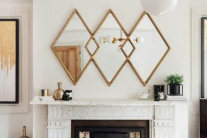
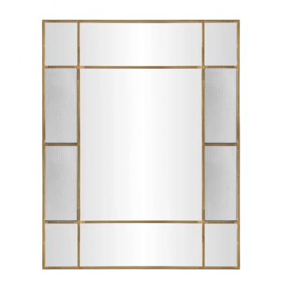
Mirrors, glazed ceramics and metallic details help distribute light more evenly. A mirror placed opposite a window can draw daylight further into the room. Positioned at the end of a hallway, it can soften what might otherwise feel like a dark stop. Above a fireplace, it can lift and brighten a focal point. Below you can see this working to great effect with the Fenton Mirror from Industville.

However, always consider what the mirror reflects as although the mirror itself might be in the perfect spot, what is it reflecting might be less than ideal!

Artificial Light Shapes the Evening

Natural light is only half the story. The way your home feels in the evening matters just as much.

Layered lighting creates flexibility:

  • Ambient lighting provides overall glow.
  • Task lighting supports function.
  • Accent lighting highlights architectural details or artwork.

Colour temperature should be chosen carefully. Very warm bulbs can distort neutral paint colours. Very cool bulbs can flatten texture. A balanced warm white usually works best in living spaces, while kitchens and utility areas may benefit from slightly brighter clarity.

If you need help using light in your interiors, get in touch. And for more interior design ideas and practical advice, follow us on Facebook.
Falling Back in Love with Your Home

It’s common for all of us to fall out of love with our homes from time to time.
We might feel like they’re no longer working for us, we’ve grown tired of the décor, or the space simply feels a little flat. Depending on what’s causing that sense of discomfort, it may be a more considered interior overhaul that’s needed — or it could be that a few focused updates will do the trick.

Either way, it is possible to fall back in love with your home. The key is understanding what’s not working before deciding how to change it.

Analyse the Discomfort

When we work with clients, one of the most important stages of the design process is understanding how their home needs to work. Before colours, furniture or finishes are discussed, we focus on function — how spaces are used, what feels awkward, and what’s missing.

You can start this process yourself by asking a few focused questions:

  • Which rooms feel easiest to be in, and which feel slightly uncomfortable or unfinished?
  • Where do you naturally sit, walk or gather — and where do you avoid?
  • Are there areas that feel cluttered, dark or impractical at certain times of day?
  • Do the rooms support how you live now?

These observations often point to layout, flow or lighting issues rather than purely decorative ones.

Getting the Right Help

Layout is one of the most common reasons homes don’t feel quite right — and it’s something we help clients with every day. Furniture that’s the wrong size or shape, tight spots, or underused areas can all create frustration, even when individual pieces are beautiful.

Often, just a couple of hours working together to review layout, flow and scale is enough to resolve issues that might otherwise linger for years. We look at how rooms are used day to day, whether key pieces are in proportion, and how the space can work more effectively.

Alongside layout guidance, we can also source the right pieces for your home. With our industry knowledge and trusted supplier contacts, we create tailored shortlists that suit your needs, budget and style — saving time and avoiding costly mistakes.

Consider the Spend

Sometimes, loving your home more does involve investing — but the key is spending with intention.

We always advise investing in the highest quality you can afford for key pieces such as sofas, dining tables and beds. These items take the most wear and have the greatest impact on how a home functions day to day.

Rather than spreading budget thinly, one well-chosen, versatile piece — whether that’s a sofa, dining table or armchair — can anchor a room and allow the rest of the scheme to evolve around it.

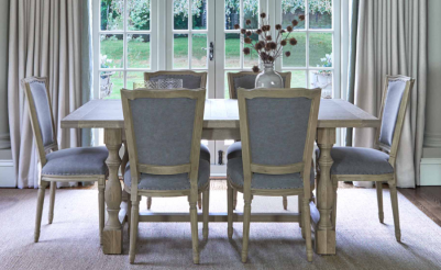
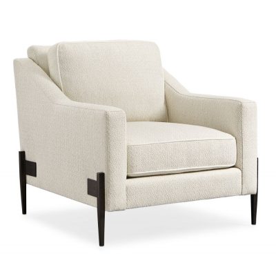
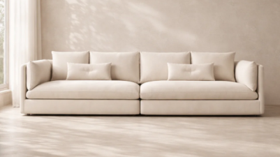
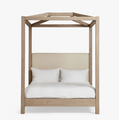
We love the timeless design of the Montague Weathered Oak Dining Table fromLa Residence Interiors, the Modern Remix Armchair from Olivia’s, and the Axis 4-Seater Sofa fromHouse of Isabella, all of which offer longevity and flexibility. In bedrooms, the Hester Four-Poster Bed fromOKA is a beautiful investment that combines comfort and luxury with lasting design.

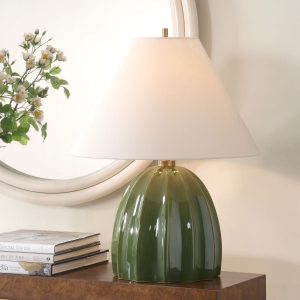
Lighting is another area where quality matters. Thoughtfully planned lighting, using a mix of fittings and light sources, often makes the difference between a space that looks finished and one that genuinely feels comfortable. We love the Renna Table Lamp in Moss Green fromSweetpea & Willow; it is a great example of a classic piece that won’t date.

Creating a Look That Evolves with You

Once the fundamentals are right — flow, layout and function, with key pieces in place — creating the look you want becomes much simpler.

With a strong foundation, it’s easy and cost-effective to refresh your home through wall colours, soft furnishings and accessories, without needing to rethink everything. Homes designed around function first tend to adapt more easily, supporting how you live now and into the future.

For more interior design ideas, follow us on Facebook — and contact us if you’d like support with your home or a specific project.

White, Done Well

The end of a year can feel like a rush, and now we’ve started the new year we have the chance to bring a sense of normality back into our homes. It’s an ideal time to lean towards lighter, calmer spaces — and white can be the perfect colour.

With Cloud Dancer named as the Pantone Colour of the Year for 2026, white is firmly back in the conversation. But rather than treating it as a trend to follow, it’s useful to consider how to use white well. Used thoughtfully, white can feel warm, considered and timeless. Used badly, it can feel stark, flat or unfinished.

The difference lies in understanding what “white” really means — and how to use it with intention

White Is Not Just Brilliant White

When we talk about white in interiors, we’re not simply talking about brilliant white emulsion on every wall.

Brilliant white is often chosen because it feels safe and neutral, but it can be surprisingly unforgiving. In many homes it appears too stark, highlighting shadows, imperfections and cooler light. Rather than creating calm, it can feel clinical or unfinished — particularly in north-facing rooms or spaces with limited natural light. Magnolia is often seen as another ‘safe’ option, but in reality it can feel dated or overly yellow.

The truth is that white comes in countless variations. Some are warm, with creamy or chalky undertones. Others are cooler, leaning towards grey or stone. These subtle differences have a huge impact on how a space feels, influencing whether it comes across as welcoming, flat or cold.

Once you move away from brilliant white as the default, the real versatility of white becomes clear. Soft whites can add warmth without introducing colour. Chalky whites create a relaxed, lived-in feel, while cleaner whites can work beautifully when balanced with texture and contrast.

This is why white interiors that feel calm and elegant are rarely made up of a single shade. Instead, they rely on subtle variation — tones that sit comfortably together and create depth without visual noise.

How Light Changes White

As we’ve briefly touched on, light plays a crucial role in how white behaves in a room. The same shade can feel completely different depending on orientation, time of day and artificial lighting.

In south-facing rooms with plenty of daylight, warmer whites help soften strong light and prevent the space feeling washed out. In north-facing rooms, cooler whites can quickly feel flat or grey, so choosing a white with warmth can lift the space significantly.

Artificial lighting matters just as much. Warm white bulbs tend to complement softer whites and natural textures, while cooler bulbs can exaggerate starkness. Layered lighting — combining ambient, task and accent lighting — helps white surfaces feel richer and more considered, particularly in the evenings.

Choosing the right white should always go hand in hand with thinking about how the room is lit, both day and night.

Using Paint Finishes to Add Depth

The finish you choose plays a key role in how white looks and feels, adding interest without introducing colour.

When designing with white, the finish is just as important as the shade itself. Different finishes reflect light in different ways, which can subtly change how a space feels.

Matt or flat emulsions absorb light, creating a soft, calm look that works well on walls and ceilings, particularly in living rooms and bedrooms. Eggshell finishes have a gentle sheen, making them a practical and attractive option for woodwork, cabinetry and even walls in busier areas such as kitchens or hallways.

Gloss and lacquered finishes are traditionally used on trim, but they’re increasingly being applied more creatively — including on walls or ceilings — for dramatic effect. These finishes require well-prepared surfaces, as they highlight imperfections, but used carefully they add crisp contrast and definition.

Trends, like the colour of the year, are best used as inspiration, but they shouldn’t dictate the design decisions for your home.

White, when used thoughtfully, has always been timeless. Its strength lies in its adaptability — it can evolve as your home changes, allowing you to refresh a space through texture, lighting and accessories rather than full redesigns.

By understanding white properly and layering it with care, you can create interiors that feel calm now and continue to work beautifully for years to come.

For more interior design ideas, follow us on Facebook.