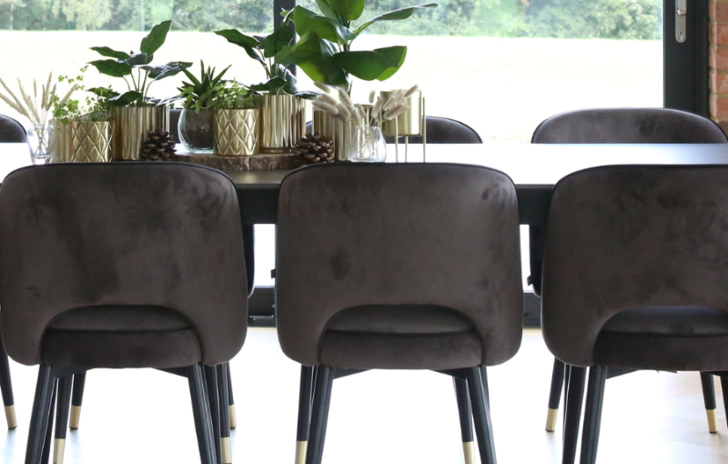
Colour has an extraordinary ability to transform a space. It can lift a tired room, add a sense of fun or calm, and even change how we experience light. But using colour well isn’t about following trends or painting everything the on-trend colours. It’s about choosing tones with purpose — and knowing how to balance them to get the effect you want.
We are going to help you use colour confidently in your home. Read on and learn how to harness colour to reflect the summer season around us.
- Start with the Feeling
The first step in using colour effectively isn’t picking paint — it’s understanding the feeling you want the space to create. Do you want a room to feel fresh and energised? Light and airy? Calm and grounding?
For example, blues and soft greens tend to evoke a sense of peace and spaciousness, making them perfect for bedrooms or home offices. Warm tones like earthy taupes and soft terracotta can bring a comforting glow — ideal for kitchens or living areas where you want warmth and welcome.
This emotional connection is where good colour choices begin. It’s also where our role, as interior designers, can be most helpful: interpreting how you want to feel and translating that into a practical palette that suits your home’s style, light and proportions.
To read more about the power of colour, click here to read our blog the power of colour.
- Balance Your Colours
Strong colours and bold patterns can be beautiful, but they’re most effective when used with care. Rather than covering a whole room in vibrant tones, think about using them as highlights — a carefully planned feature wall doesn’t have to be cliche, it’s about ensuring the base tones are cohesive throughout the space and the wall feels planned and thought through – not added randomly – or try a patterned chair, or a few key accessories such as lamps or artwork against a neutral backdrop.
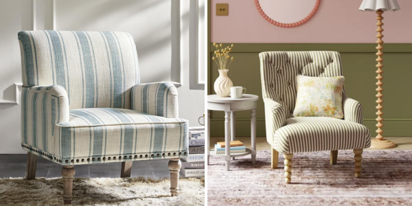
We love… the Hulala Home Modern Accent Chair from Amazon and the Adrianna Linford Stripe Armchair from Dunelm. Stripes are working well right now, but also are more timeless than other prints
This not only creates more visual impact but keeps your space feeling calm and considered. Using colour in this way also gives you the flexibility to update your scheme easily — whether seasonally or simply when you fancy a change. A few cushions or ceramics in a new shade can change the mood of a room without changing everything.
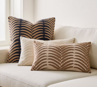
We love… the Woven Palm Cushion Covers from West Elm which are easy to use and style as work well together to give a botanical feel with warm tones.
- Swap in seasonal textures and fabrics
One of the easiest ways to refresh your space for summer is through textiles. Changing up cushions, throws or even curtains is a quick way to introduce colour without long term commitment — and it allows you to reflect the season with very little effort. If you’re using accessories for pops of colour, you can change the feel of the room whilst making sure the colours are balanced.
In summer, we tend to use more natural, breathable materials: cottons, linens and voiles. These not only feel lighter, but they carry colour in a soft, diffused way that suits the brighter days.
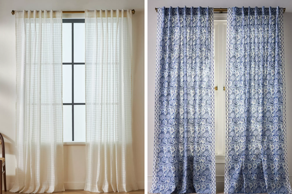
We love… The Sheer Grid Curtain from Anthropologie or for something bolder, go for the Cotton Woven Block Print Curtain also from Anthropologie.
- Let nature inspire the palette
Summer is a season of rich, natural colour — and it’s the perfect time to bring the outside in. From floral tones to leafy greens and terracotta earth shades, nature provides one of the most timeless and satisfying palettes available.
Consider introducing cut flowers, indoor plants or terracotta pots on windowsills. These bring natural movement and softness to a room, and help create a visual link between indoor and outdoor spaces — especially in homes with gardens, patios or bifold doors. Faux florals and foliage is a great alternative to fresh flowers and plants if you’re not green fingered or want a low maintenance options.
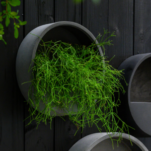
We have recently used the Wally Natural Plant Holders from Hortology in the renovation of Real Coffee Shop in Bedford with plants from Not Another Jungle. These two are just around the corner from each other, so why not grab a coffee and then head for a browse at the gorgeous greenery!
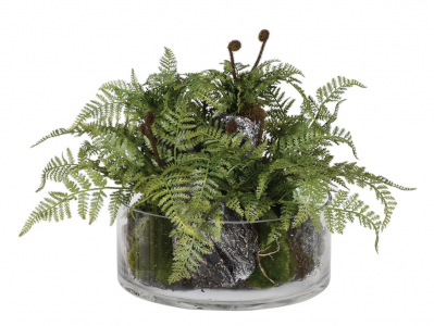
We have used the Moorside Faux Fern Ornament in a Glass Bowl from Shropshire Design multiple times with different clients. It’s perfect for areas where you want a wide but low-profile piece, such as coffee- or side-tables.
These small touches often do more to connect a room to the season than any trend-led makeover.
- Avoid trend-chasing
At Interiors at 58 we keep up to date with trends and are often inspired by what is around us, we don’t, however, follow trends for the sake of it. This will lead to interiors that easily date and often aren’t quite right for your home. The choice is colour is deeply personal, and what works in one home might not feel right in another, or even if one area or your home or another as light can really affect the way a tone feels in a room. This is why we work with people – our clients – and not from trends. The goal is always to reflect your style, taste and lifestyle — not what’s current on social media.
Currently, we are seeing a rise in softer, sun-washed tones: muted greens, warm putty, earthy pinks and pale yellow accents. These colours are gentle but cheerful — and incredibly liveable. If these are right for you and your home, they could well be on the short list.
If you’re ready to bring more colour into your home but aren’t sure where to start, we’d love to help. Whether it’s a full redesign or a seasonal refresh, we can guide you in choosing the right palette, textures and details to reflect your style and bring your space to life — this summer and beyond. And remember, for more ideas and inspiration follow us on Facebook.