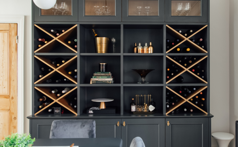
Bold colour has a way of capturing attention. Whether it’s a striking feature wall, richly painted cabinetry or statement tiles, it often appears in the most inspiring interiors. But while it’s easy to admire, it can feel much harder to commit to in your own home.
Trends come and go, and what feels exciting now can quickly feel dated. More often than not, the hesitation isn’t about liking colour — it’s about wondering whether it’s the right choice for your space, and whether you’ll still love it in a year’s time.
The key to using bold colour successfully isn’t about being brave. It’s about being considered.
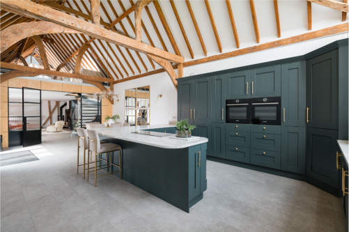
Why Bold Colour Can Feel Daunting (And How to Approach It Properly)
Choosing bold colour can feel like a big step. Unlike smaller decorative changes, it’s more visible, more impactful, and often more permanent. That’s what makes it feel daunting.
But this isn’t about taking a leap into the unknown. It’s about making a decision you feel confident in.
Testing is where that confidence comes from. Rather than relying on a small paint card or a quick decision, take the time to see how a colour really behaves in your space. Use larger samples, place them in different areas of the room, and look at them at various times of day. Natural and artificial light will change how a colour appears, sometimes quite dramatically.
Living with a sample for a few days allows you to move beyond first impressions and make a choice that feels right long term.
Start With How You Want the Room to Feel
Before choosing any colour, it’s important to take a step back and think about the purpose of the room.
How do you want it to feel? Energised and sociable, or calm and restorative? A bold colour should support that feeling, not work against it. This is where colour becomes more than a visual choice — it becomes a functional one.
If you’d like to explore how colour influences mood and atmosphere in more detail, you can read more in our blog, The Power of Colour.
Starting with feeling, rather than colour itself, helps guide decisions in a way that feels much more natural and cohesive.
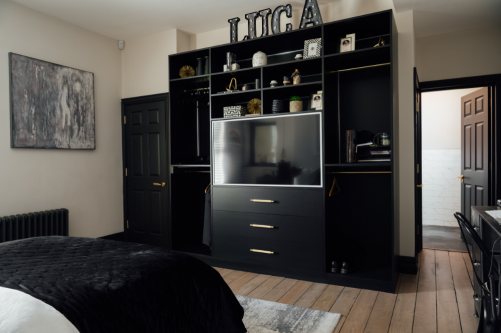
Choosing Where Bold Colour Works Best
Introducing bold colour isn’t about adding more — it’s about placing it with intention.
There are many ways to bring stronger colour into a space. It might be through paint or wallpaper, cabinetry, tiled areas such as splashbacks, or architectural features like panelling and alcoves. The approach you take will depend on the space, but the principle remains the same.
Think about what naturally draws the eye when you enter the room. This is often the best place to introduce a bold element. Used well, colour can highlight key features and create a sense of balance within the space, rather than competing for attention.
It’s also important to consider how the colour sits within the wider home. A bold choice should feel connected, not isolated, particularly in open-plan or adjoining spaces.
Getting It Right: Practical Considerations
Bold colour works best when the practical details are carefully considered.
Light plays a significant role. North-facing rooms can soften and cool colours, while south-facing spaces tend to enhance their warmth and intensity. Understanding this helps avoid surprises once a colour is on the wall.
Undertones are equally important. A colour that looks perfect in isolation may clash when placed alongside flooring, cabinetry or existing finishes. Viewing everything together ensures a more cohesive result.
Taking time with these decisions makes all the difference. The most successful schemes are rarely rushed.
Refining Your Colour Choice
If you’re unsure about committing to bolder colours, it can help to look at less primary options.
For example, a deep grey-blue or grey-green can feel softer and easier to live with, while still adding the sense of drama you’re looking for. If you’re leaning towards warmer tones, there are some beautiful deep burgundy and maroon shades available at the moment. These work particularly well in cosy spaces such as dining rooms or snugs, where you want to create a more intimate feel.
Another way to approach a darker colour palette without it feeling overwhelming is to be more selective about where you use it. Applying colour to woodwork or the ceiling allows you to introduce depth and contrast, while keeping the walls lighter and more neutral.

Confidence Comes From Clarity
Using bold colour doesn’t need to feel overwhelming. When decisions are guided by purpose, placement and careful testing, they become much easier to make.
A well-chosen colour has the ability to completely transform a space, adding depth, character and a strong sense of identity.
If you’re unsure where to start, this is exactly where professional guidance can help bring clarity and confidence to your decisions. And for more ideas and inspiration, you can follow along on Facebook.